36 | SPRING 2018
CHICAGO WEDDING & PARTY RESOURCE
CHICAGOWEDDINGRESOURCE.COMCHILI OIL
PINK
LAVENDER
BLOOMING
DAHLIA
ARCADIA
EMPERADOR
ALMOST
MAUVE
SPRING
CROCUS
LIME PUNCH
SAILOR BLUE
HARBOR MIST
WARM SAND
COCONUT
MILK
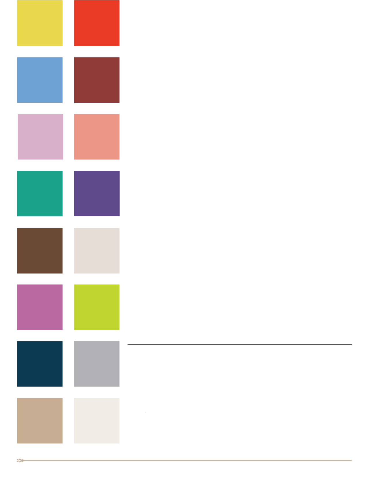
16 Shades of 2018
Spring 2018 is blooming with 16 shades of color to choose fromwhen planning the colors for your
wedding. You have the choice of using a single color, two, three, four or all sixteen to make your
wedding color choices your personal statement of color for your special day. On the following pages
are many inspirational photos of ways to use color in flowers, dresses, cakes, decorations, menswear
or invitations. The 2018 color palette allows you to choose warm or soft or bright or subtle shades
in your wedding. Choose from:
Meadowlark
– beautiful bright yellow shade that can be used alone or paired with any of the
other 15 shades in the spring 2018 color palette.
Cherry Tomato
– hot and spicy orange red shade that pairs well with almost any color.
Little Boy Blue
– reminds us of the summer blue sky and is a stunning shade to use with any of
the other 2018 colors.
Chili Oil
– brown red that reminds us of the earth and looks magnificent paired with the 2018
color choices.
Pink Lavender
– romantic, feminine, soft shade of pinky lavender that mixes well with
sumptuous spring colors.
Blooming Dahlia
– peachy pink that says spring/summer when used alone or combined with
all of the other lively colors shown for 2018.
Arcadia
– retro modernist shade of turquoise that is a strong stand alone color or a color choice
that can be used with almost any spring color choice.
Ultra Violet
– the Pantone® 2018 Color of the Year is a purple shade that can be used with any of
the 2018 spring fashion palette colors.
Emperador
– chocolate brown combined with lively yellow, pinks, blues, greens, lavenders will
create a unique colorful wedding sure to be remembered.
Almost Mauve
– pale, delicate, ethereal shade of pink with purple undertones exudes a soft,
gentle color that says spring/summer no matter what other colors you use it with.
Spring Crocus
– one of the first blossoms we see peaking out of the snow is the crocus and this
shade of fuchsia is perfect for a spring/summer wedding.
Lime Punch
– a bright and sunny yellow with a hint of green will remind you of the color of
lemonade/limeade and what could be more summery.
And the classic color neutrals that you can use as a foundation when selecting your own personal
color palette for your wedding or use them alone or mix and match for a truly memorable array of
color:
Sailor Blue
– a navy blue that is always classic in taste and is a neutral that you can use with any
of the other 15 spring colors.
Harbor Mist
– dove gray that is always a beautiful choice for any color palette.
Warm Sand
– timeless neutral that is perfect any time of the year and ideal with any color.
Coconut Milk
– just a bit off-white that is slightly softer than a stark white shade that can be
used with any color, any season or used alone.
MEADOWLARK
CHERRY
TOMATO
LITTLE BOY
BLUE
ULTRA VIOLET


